
NUBA
SERVICES
Research&Analysis
Branding
Art Direction
UX / UI Design
Development
BRIEF
We were assigned the redesign of NUBA’s website, Spain's most prestigious luxury travel agency. Over the past few years, NUBA had fallen behind and, eager to embrace the latest technologies, required a web design that not only reflected their expertise but also aligned seamlessly with their brand values, positioning, and the high-quality standards of their target audience. The existing web design fell short on all fronts and needed a transformation of its online identity.
O&R STRATEGY
We began by conducting extensive research to identify key elements that would inform our new design strategy.
Based on our competitive research and benchmark, we discovered we’d have to not only redesign its online presence by creating and designing a new digital product but also we’d have to create and clean their existing brands within one umbrella keeping the logo intact. The challenge was to create a cohesive and visually stunning online experience that reflected NUBA's commitment to prestige, luxury, and unparalleled customization.

UX DRIVEN DESIGN
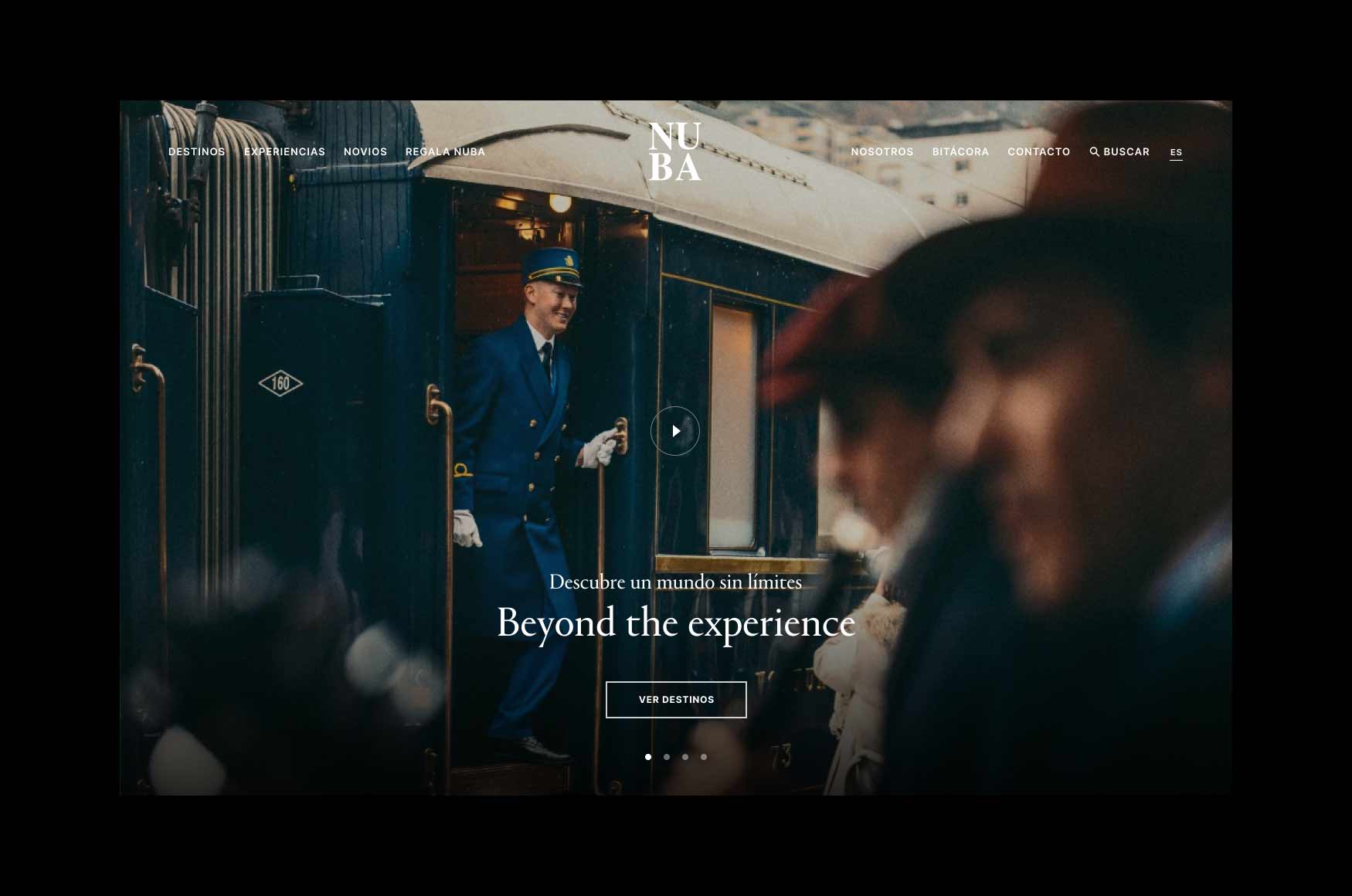
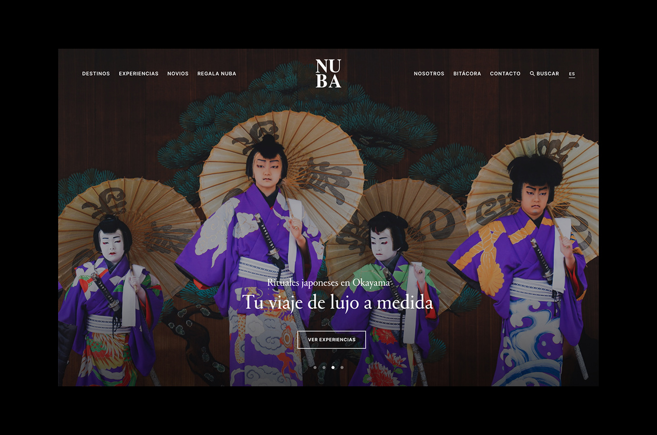
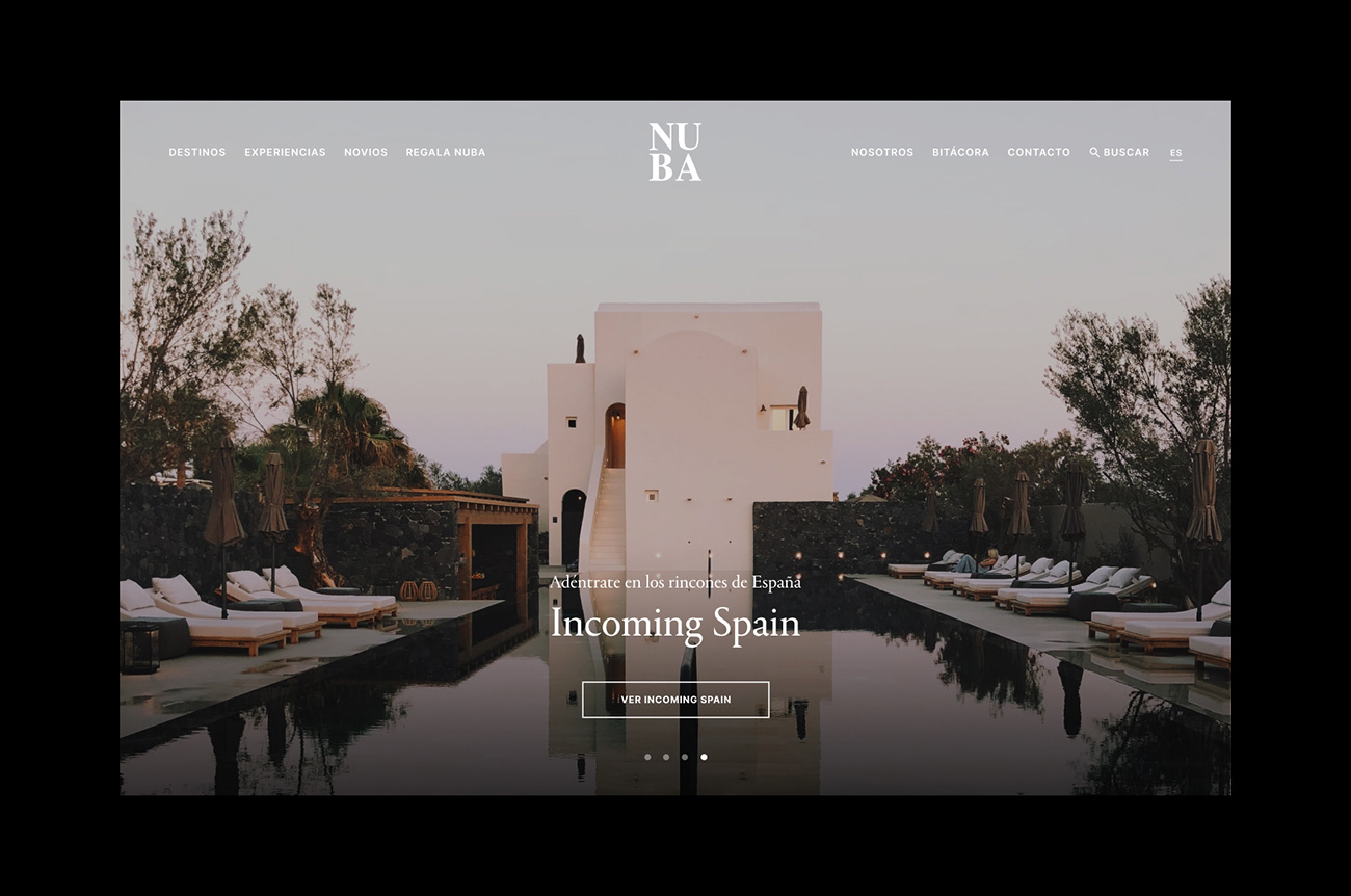
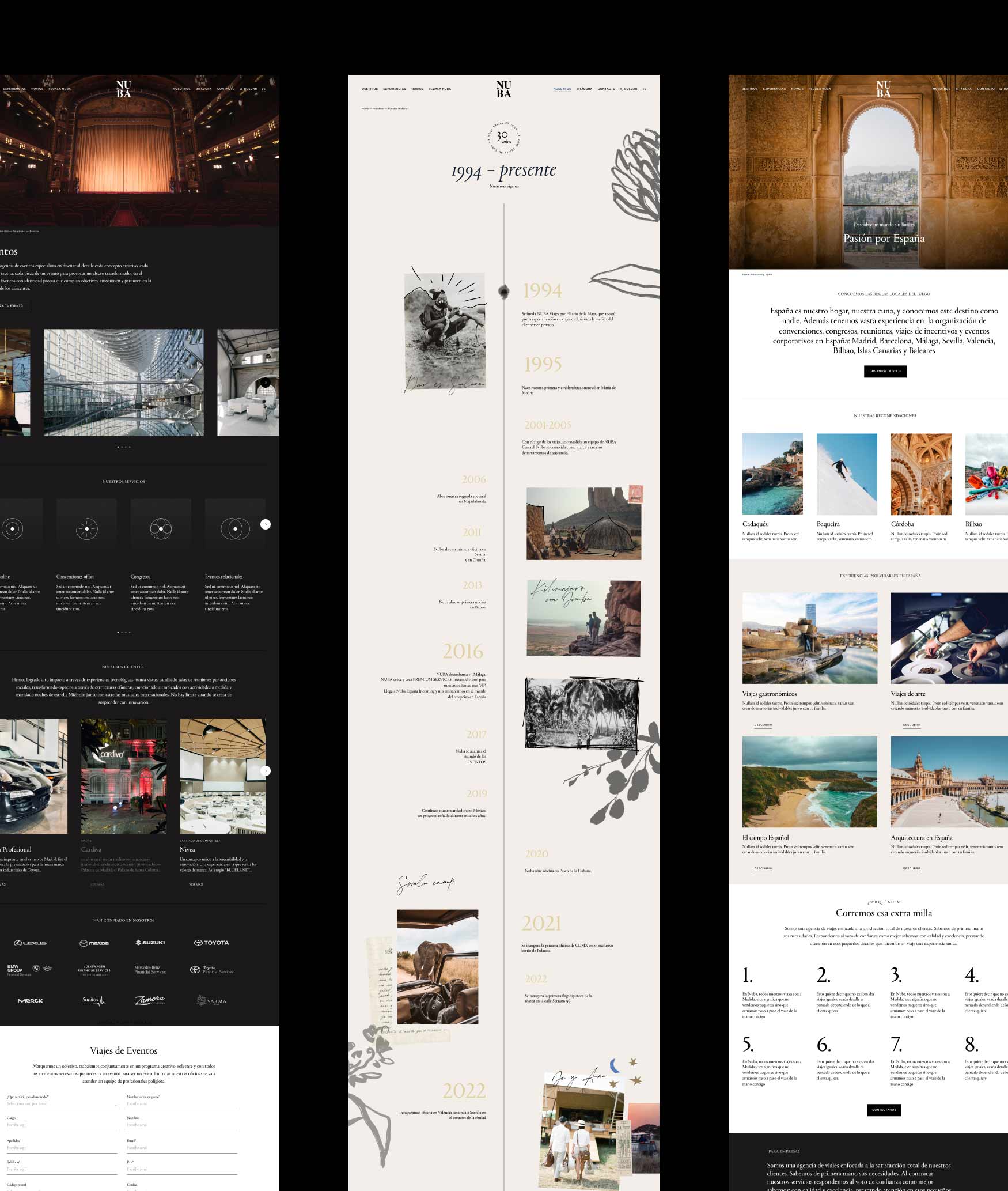
We based our approach on user centered design experience. Polished visuals with new typographies, color palettes and layouts played a pivotal role in conveying the desired image, striking a balance between classic elegance and modern simplicity. The wide layouts with prominent text, predominantly in black and white, allowed the aspirational travel photos to take center stage, creating a visually impactful narrative.


ENGAGING THE USER
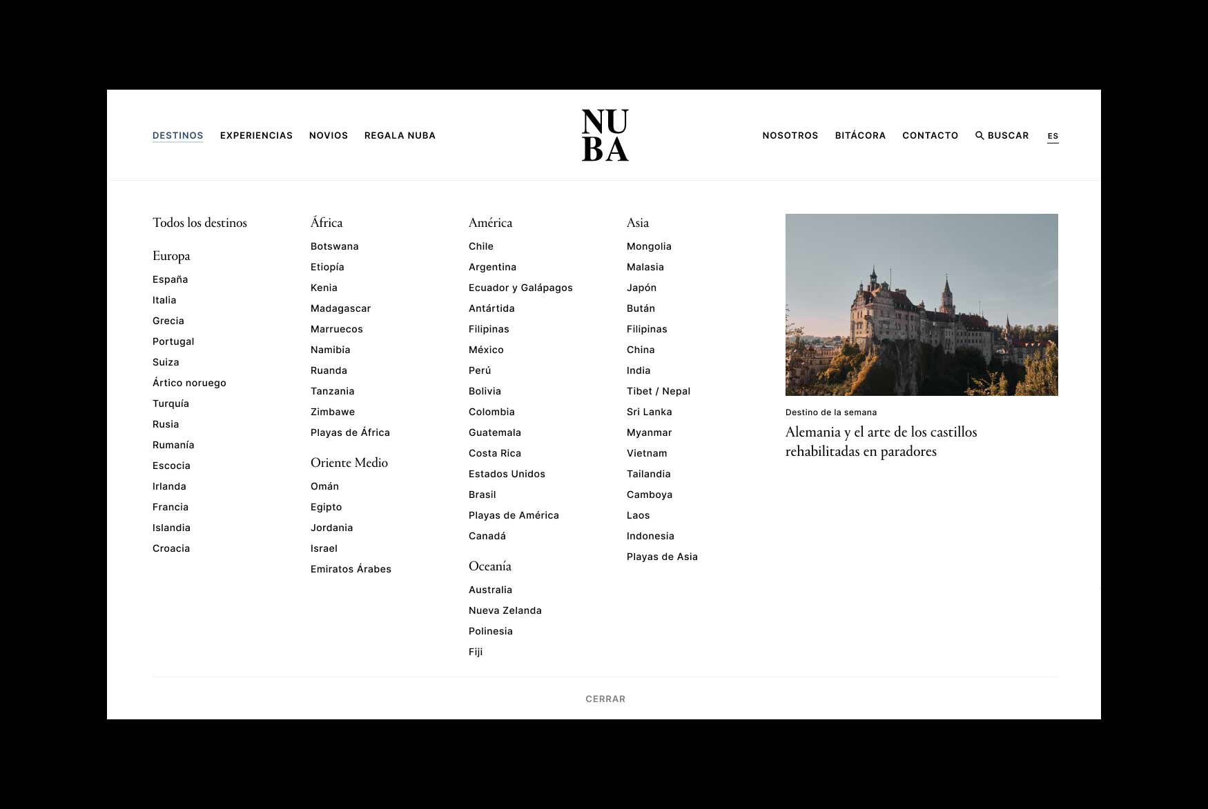
Afer analyzing the user experience we designed a new navigation, with various mega menus and feature media kits. We incorporated a dynamic home page for rotating features, a quiz to engage users and to gather data for newsletter segments.
CREATING PROVOCATIVE LAYOUTS
Nuba’s expertise is well-known in Spain. One of their primary challenges was to present the extensive content about their unique destinations and know-how in an appealing and evocative manner. We chose an editorial-inspired aesthetic, drawing inspiration from a time when travel magazines were the go-to source for dreaming about destinations. In line with our design philosophy, the images take center stage. Given the multiple levels of information on these pages, we needed to group and display it in engaging ways. To enhance navigation, we introduced moving submenus on the country pages, making the browsing experience easier and more intuitive. The blend of typography, ample white space, and striking imagery proved to be a winning combination.


FORGING DEEPER CONNECTIONS
For three decades, Nuba has been a staple in the market. One of our goals within the new design was to forge a closer connection between users and the company, to create a bond that humanizes the brand. We developed and designed an interactive timeline page to spotlight Nuba's rich history. With a scrapbook-inspired design, the page showcases vintage photographs from their initial travels to Africa, accentuating the brand's emphasis on tailored and personalized experiences.
CURATING THE IMAGE CATALOGUE
Choosing striking imagery was paramount for this project. One of our key tasks was to curate and establish the art direction for the photographic catalogue. Keeping in mind NUBA specializes in selling luxury experiences it was key for the project to define a new art direction for the website photography, we had to be able to transport the users to these magnificent destinations with the new selection of images. We made the photographs the lead role of the website.

A NEW GIFT REGISTRY EXPERIENCE
To enhance the wedding registry experience, we aimed at aligning seamlessly with the usability and overall experience offered by popular wedding registry websites. To bridge the gap between what NUBA was providing and the specific needs of brides and grooms, we conducted interviews to gain insights into their preferences and expectations. Recognizing wedding lists provide a distinct opportunity to introduce the brand to a wider audience—the guests—we integrated innovative features, including the use of QR codes. This streamlined the guest experience, making the transactional aspect of gift-giving more convenient and modern.


A NEW BLOG
Moreover we redesigned the blog from its core to re-create a lifestyle magazine that serves as reference in the travel industry.

