
IML Clinic
SERVICESResearch&Analysis
Branding
Collaterals
Art Direction
UX / UI Design
BRIEF
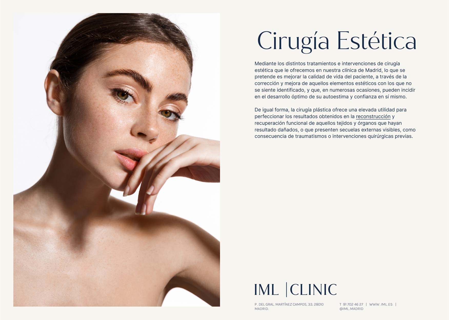
Instituto Médico Laser, a leading plastic surgery clinic in Madrid approached us to rebrand and relaunch its clinic while launching a new sub brand of beauty centers for a different demographic. Renowned as pioneers in laser hair removal in Spain, they have garnered an excellent reputation for medical practices, however, the new generation perceived the brand as outdated and irrelevant.
O&R STRATEGY
Our first design decision was to set aside the long name and replace it with its acronym 'IML,' allowing its use across sub-brands. The evolution involved incorporating the term "Clinic" into the name, emphasizing the range of both surgical and non-surgical treatments, steering it away from its reputation as a laser only clinic.

CREATING SISTER BRANDS
We faced the challenge of launching two brands simultaneously: one involved rebranding the existing clinic, aiming for a modern appeal, and the second an entirely new brand—an on-the-go aesthetic center. We created a connection between them, positioning one as the younger sister, both using the acronym. Both brands share typography but employ different color palettes, with the clinic adopting classical subdued compositions and the Skin Center embracing bolder and more dynamic arrangements. The intention of these design choices was to convey their connection while highlighting their differences.


UX/UI
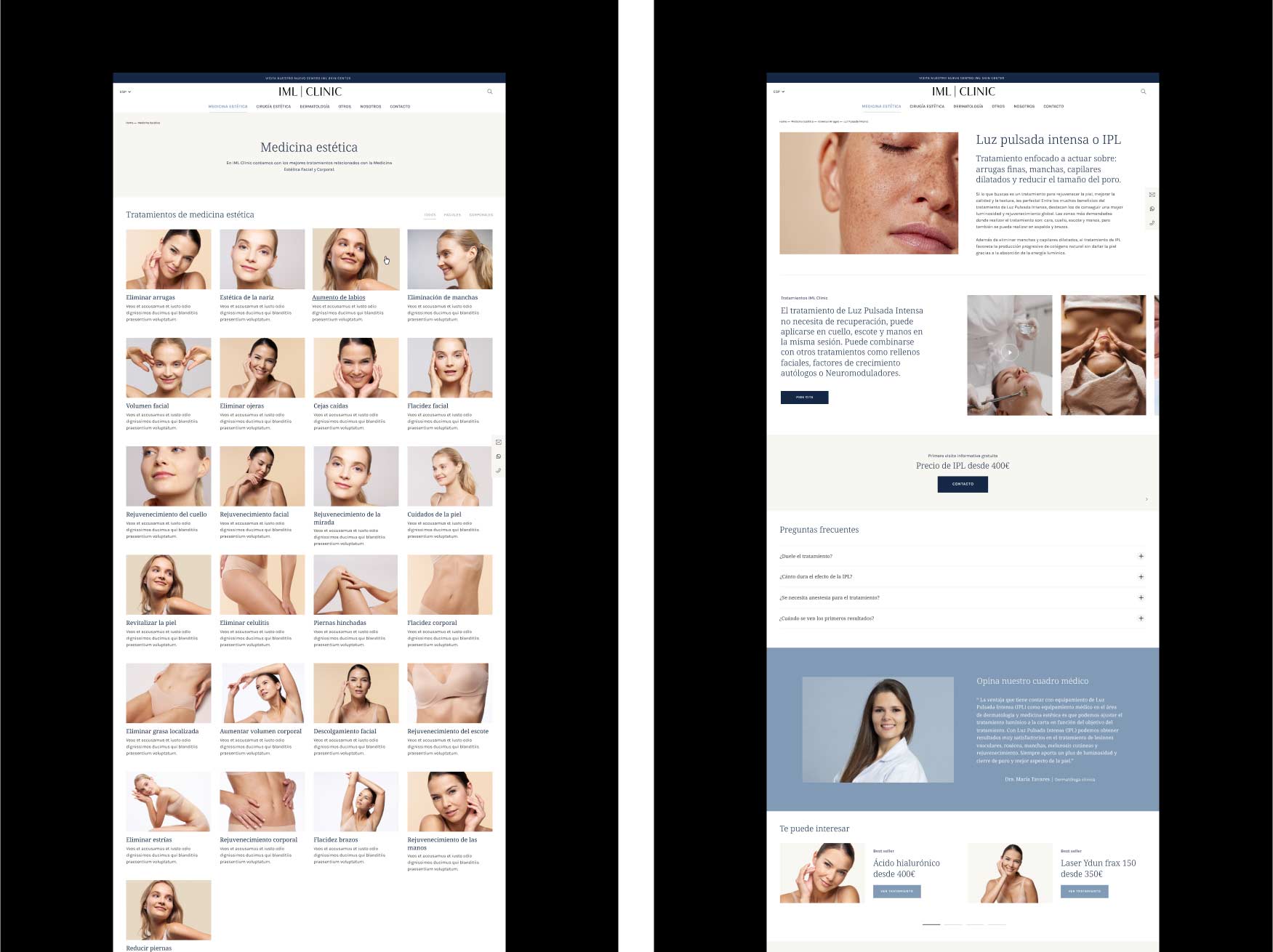
During the website redesign, we had to make sense of IML's extensive treatments and procedures, considering the robust body of cosmetic offerings. The initial SEO-driven format made it difficult for users to navigate intuitively, but its parameters posed restrictions, requiring a balance between intuitive navigation and search engine optimization. We prioritized enhancing the overall user experience (UX) by redefining navigation elements. Considering the growing trend of mobile users, we fine-tuned both desktop and mobile navigation, prioritizing a seamless product discovery experience.
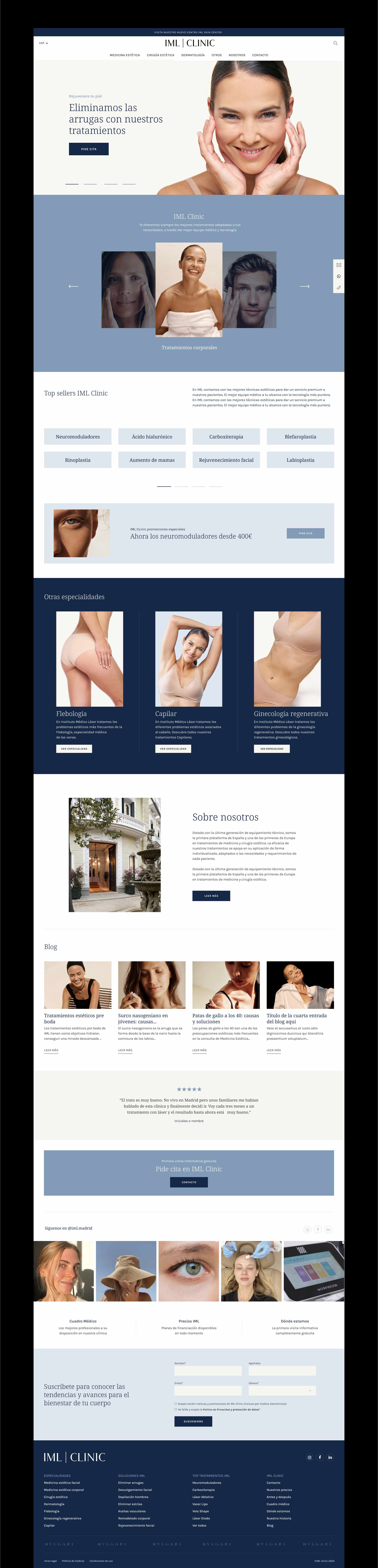
NEW NAVIGATION
Embracing the power of mega menus! The site’s extensive content made navigation challenging, prompting us to integrate mega menus across all categories. This allowed us to display all treatments within a category simultaneously, while also showcasing featured treatments with eye-catching photographs to stand out.

RESPONSIVE DESIGN
It was crucial to implement responsive design to ensure optimal functionality across all devices. Our primary focus was simplicity for a content-heavy site, guiding our decisions throughout the process to enhance information readability and navigation. Emphasizing a more intuitive mobile navigation with special products played a pivotal role in the design, allowing users to explore the site’s treatments. Art directing the photos became an important part of the project, as we transitioned from outdated stock imagery to a more modern visual approach.


RESPONSIVE DESIGN
We crafted the website to be fully responsive, ensuring a sleek appearance across all breakpoints and browsers. Our guiding principle was to maintain a tidy grid and organize elements with a clear hierarchy. Additionally, we introduced solid backgrounds strategically to punctuate the page and effectively separate information, enhancing readability and user experience.

