
IML Skin Center
SERVICES
Research&Analysis
Branding
Art Direction
UX / UI Design
Development
BRIEF
We were tasked with the development of IML Skin Center a new sub brand of Instituto Médico Laser. The new brand emerged as the contemporary younger sister of the long-established IML beauty clinic. Positioning itself as a modern hub for non-surgical medical aesthetic services, IML Skin Center aimed to attract a new generation seeking on-the-go treatments.
CHALLENGES
We faced the challenge of launching two brands simultaneously: one involved rebranding the old Instituto Médico Láser and the second was the creation of this new brand —an on-the-go aesthetic center. We created a connection between them, positioning one as the younger sister, using the acronym IML. Both logos share the same typography but employ different color palettes, with the clinic adopting classical subdued compositions and the Skin Center embracing bolder and more dynamic arrangements. The intention of these design choice was to convey their connection while highlighting their differences.


OUR STRATEGY
Since our targer audience is very fashion-forward, we aimed for a balance between the clinical aesthetic associated with medical expertise and the vibrant, colorful feel of the fashion and beauty culture.


UX/UI DESIGN
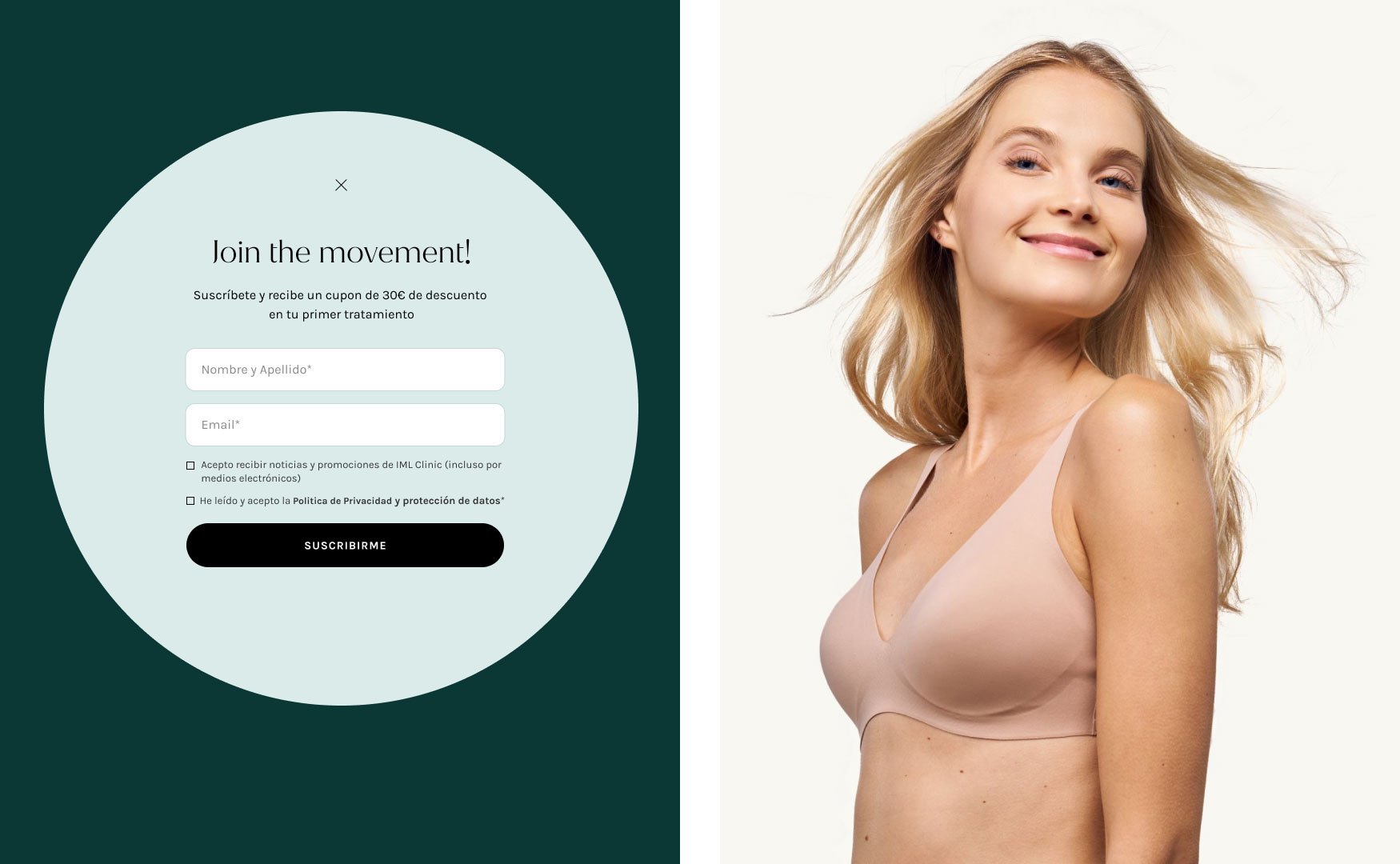
The website had to reflect the young personality of the brand. We designed and developed a bespoke site overviewing all the steps from responsive wireframes to visuals and full development of the digital platform. Knowing the primary target audience would be a young demographic, the project was designed as mobile first.
We crafted a module-based design, playing with colors and bold typography to establish a clear hierarchy of information. We created contrast in font sizes and implemented an animated hovering system, making the content-heavy website more appealing and easy to navigate.
We crafted a module-based design, playing with colors and bold typography to establish a clear hierarchy of information. We created contrast in font sizes and implemented an animated hovering system, making the content-heavy website more appealing and easy to navigate.

CUSTOM CMS
We created a module-based layout combining big type and broad photos and focused on an appealing user experience. Small tech touches such as dynamic hero banners, pop-ups and small animations enhance the clean and elegant aesthetic and reflects the brand's commitment to sophistication and modernity. With the technology we ensured optimal performance and a responsive interface, aiming the younger tech-savvy audience.


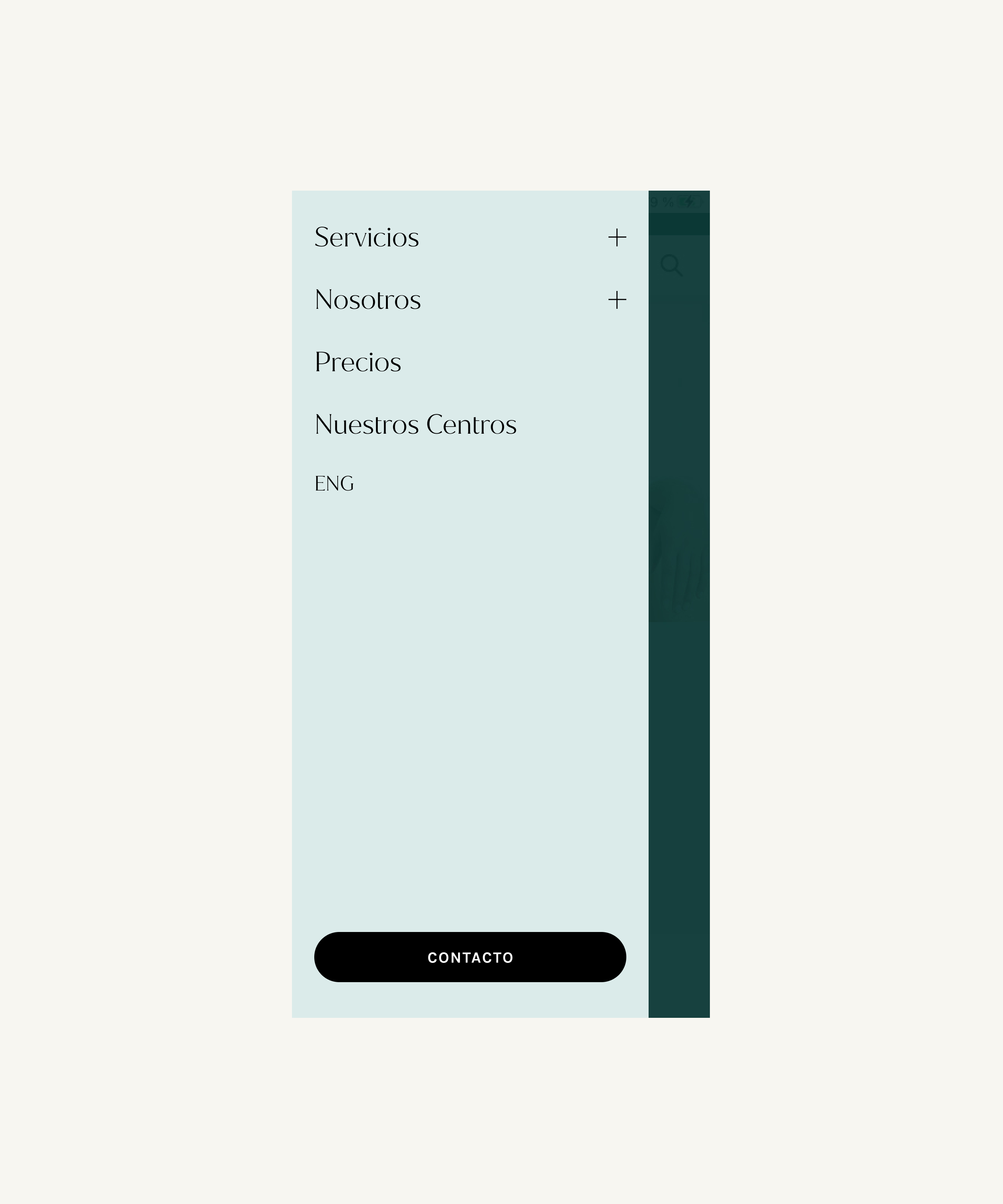
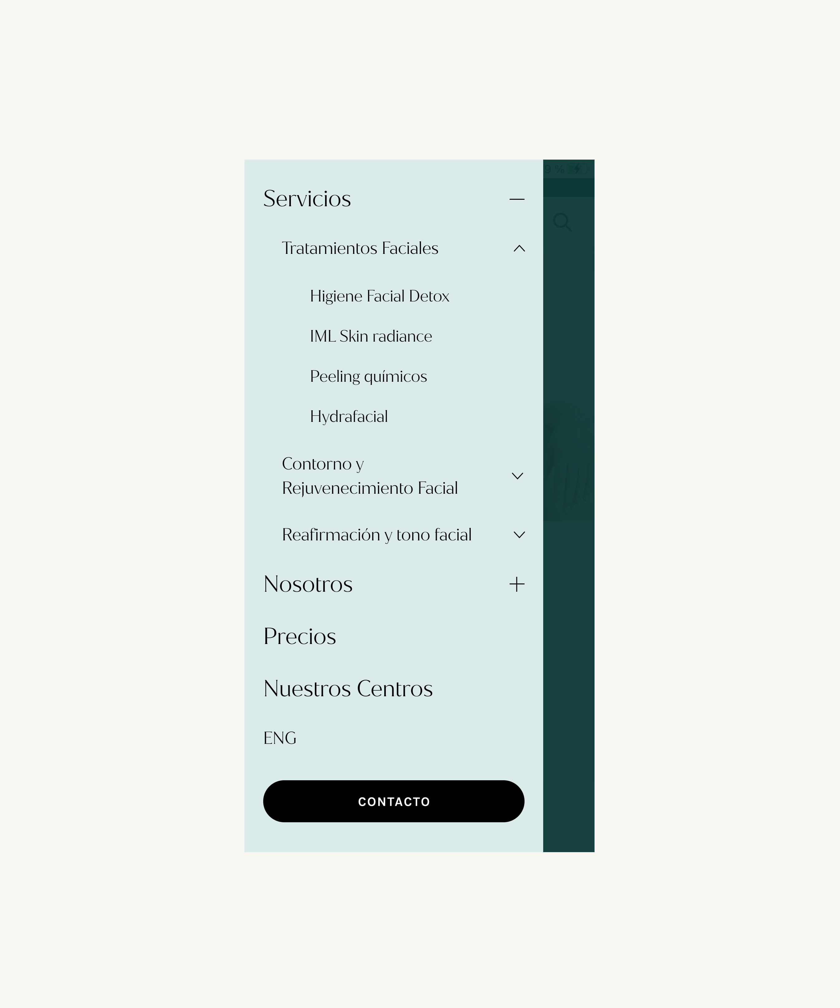
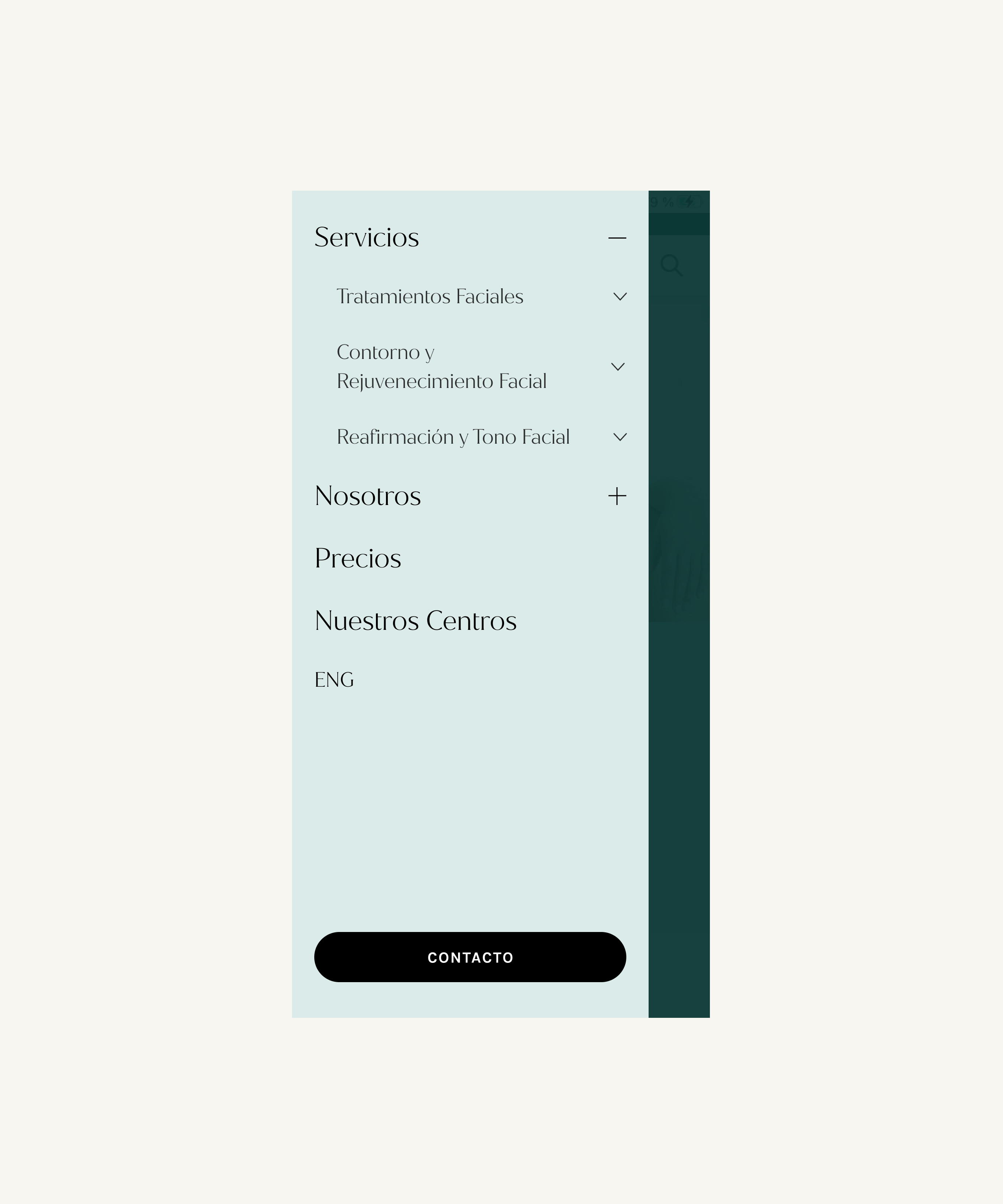
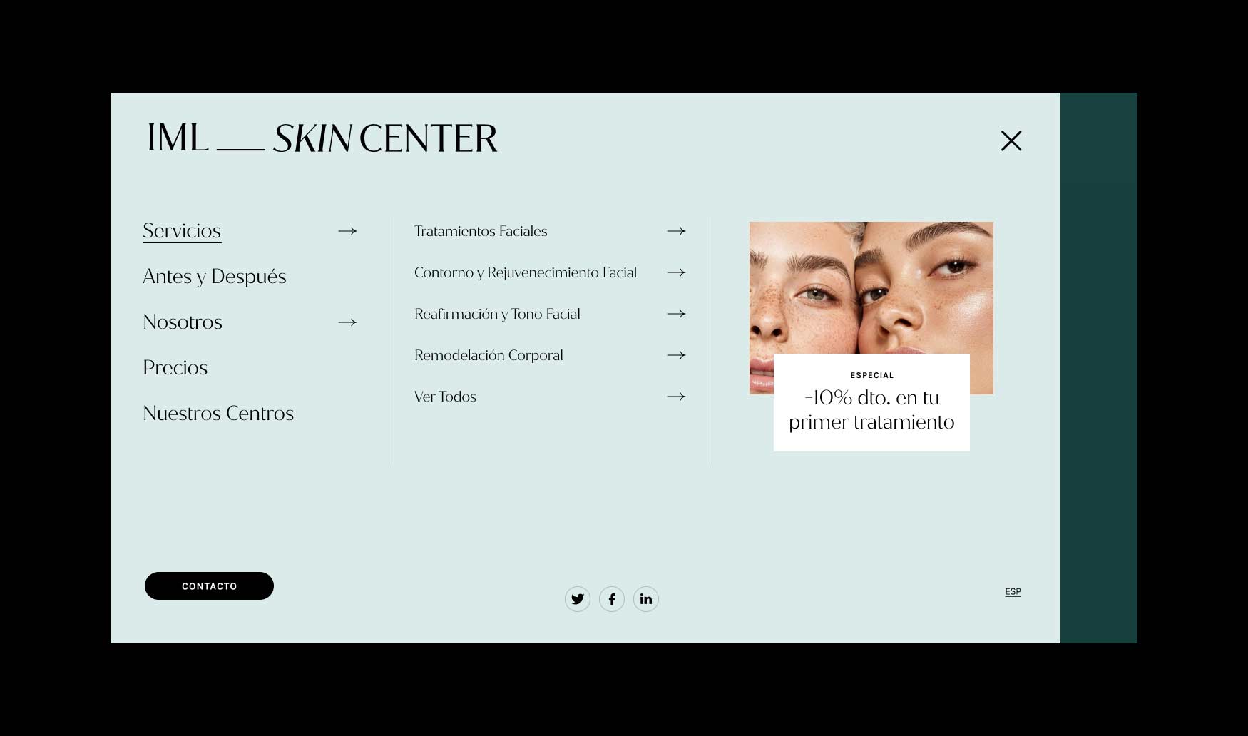
DYNAMIC MEGA MENUS
For the navigation, we opted for a hamburger menu that, when opened, displayed the five main sections of the website vertically. Subsequent sub-menus opened to the right, creating three different levels of visible information. This approach saved users from having to click back and potentially get lost. With everything still visible on the navigation menu, this information-filled website is very easy to navigate.

CREATING A SMOOTH NAVIGATION
Our dynamic doctor's page enables users to quickly open and close individual doctor's tabs without leaving the page or having to navigate to a new one, facilitating easy navigation within the site.

